A type of excellence
Most people can identify a loved one with a glimpse of an eye or mouth. For Daniel Mayer — printmaking instructor at the Herberger Institute for Design and the Arts’ School of Art — a single letter, comma or ligature can be adequate to identify one of the hundreds of typefaces that make up Arizona State University’s more than 3,000 cases of metal and wooden type.
The collection grew dramatically in early 2016 when ASU was gifted the Adam Repan Petko Type Collection, consisting of some 1,600 cases of type (enough to fill two semi trucks) and printing presses that include an ornate 1834 Columbian Press.
The collection — which is named for the donor’s father, a dermatologist interested in preserving printing technology — makes ASU’s type collection the largest at any institution of higher education in North America.
“The pristine type was collected from commercial letterpress shops by Dr. Petko over many years as the print industry changed,” said Mayer, who is also director of Pyracantha Press, the School of Art’s production and research imprint. “We’re identifying it case by case.
“For example, there was a piece of type on the table, and it was a period in a diamond shape. The Goudy period was designed as a diamond. So you can pick up a letterform and identify it as Goudy, or Palatino. Selecting typefaces for a project is essential whether it’s for an artists’ book, broadside or ephemera as type has a voice.”
ASU’s printmaking program, which was recently ranked fifth in the country by U.S. News and World Report, houses its letterforms, punctuation marks, spacers, composing sticks and presses in the Art Building, at Hayden Library and in a new glass-front pop-up studio in the Tempe Center building on the northeast corner of 10th Street and Mill Avenue so that community members can easily engage with ongoing printmaking projects.
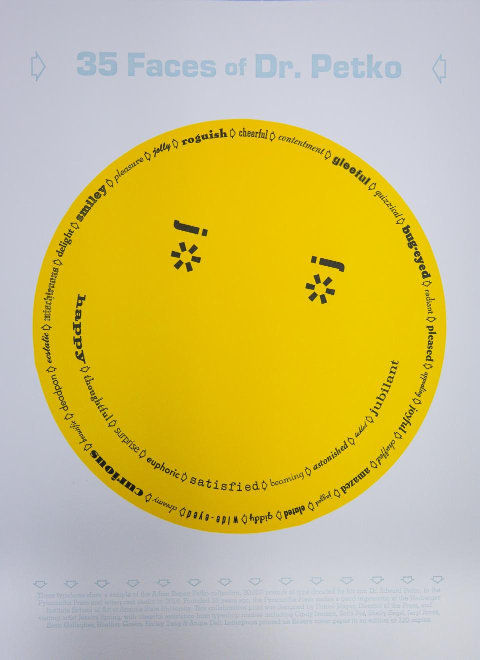
The inaugural guest artist to work in the pop-up space was printmaker Jessica Spring. Spring, who lives in Tacoma, Washington, spent a week in March collaborating with Mayer to create a commemorative letterpress print celebrating the Petko donation and paying tribute to the 35th anniversary of the Pyracantha Press.
She also taught workshops to ASU students and visitors who traveled to campus from the Phoenix metro area, the University of Arizona, Prescott, Flagstaff and New Mexico.
Spring and Mayer’s print, “35 Faces of Dr. Petko,” features a vibrant yellow smiley face — a nod to Petko’s career in dermatology — circled by 35 adjectives. Each word is hand-set in a typeface from the Petko Collection that the artists thought best conveyed its meaning.
Spring, proprietor of Springtide Press, is perhaps best known for her collaborative broadsides series “The Dead Feminists.” She often works in a style she calls “daredevil letterpress,” which consists of novel ways to hand-set type in non-traditional curves, waves and other shapes.
“I do daredevil printing, and ASU is home of the Sun Devils, and it’s a big, sunshine face,” Spring said of the final product, noting that its headline features the 1960s typeface Eurostile, which aligns with when the bright, smiling icon became popular.
To determine which typefaces to use, Spring, Mayer and Creative Research graduate assistant Sofia Paz gathered word lists and acted out traits that came to mind for letterforms that would best represent what it meant to be “gleeful” or “jubilant.”
“We decided ‘satisfied’ needed a typewriter font, for instance,” said Paz, who is the first year of her MFA program in printmaking.
Paz, who did not have much background in letterpress before joining ASU, says working with movable type has changed the way she interacts with her computer.
She thinks differently about what it means to select a 12- or 14-point font, or to use an “upper case” letter (letterpress printers traditionally worked simultaneously from two cases; frequently accessed, non-capitalized letters were stored in the lower case and capital letters were placed in the upper, harder-to-reach case). She says she instinctively searches her word processer for her favorite typefaces from the Petko Collection, even if they don’t exist digitally.
“I’ve only been doing this for a semester now, and I feel like it’s already getting engrained in my psyche,” she said.
“It catches students, especially when they’re using typefaces on the computer. That’s virtual — but in the letterpress studio it’s very physical,” said Mayer. “They’re picking up a character letter by letter and making words, making sentences, making paragraphs that are composed in tandem with other graphic processes such as woodcuts, silkscreen and newer digital technologies. It makes you pay attention to what it is and how it’s been done, while respecting the history of the printed word.”
While “35 Faces of Dr. Petko” was made to shepherd the Adam Repan Petko Type Collection into its new home, working on it also put a smile on a different newcomer’s face.
“I’ve lived in Argentina, Switzerland, Colorado and Texas and I never felt like I found home, but I feel like I have at ASU,” Paz said. “I know it’s kind of cheesy, but when the day is over, I don’t want to leave. After cataloging type for five hours straight, I don’t want to go! I just want to be here with everyone. I feel so welcome and they support one other, and the connections you make are just invaluable.”
To view or purchase the inaugural letterpress print, or to visit the Adam Repan Petko Type Collection in the School of Art, please contact Daniel Mayer at daniel.mayer@asu.edu.
Additional public book-arts activities can be found through ASU’s student artists’ book collective:www.abunchabookartists.com.


